Sometimes the most heartbreaking thing about being a creative for a living is when a client has negative feedback.
It looks a little something like this: you go through a discovery process, you ask all the right questions, you and your client are jiving and on the same page, you pull inspiration and the client gives you a big thumbs up. You spend days sketching, refining, and finalizing a design that makes you proud. It just might be your best work yet.
Then, you present a design to your client. You can read their face – they aren’t loving it. Or maybe they take their time getting back to you – you take the silence as criticism and start beating yourself up over what they’re thinking. Maybe they come back with “I love it, but could we change …” followed by revisions that butcher your work into something that resembles nothing you would ever create. You find yourself feeling like a pixel-pushing order-taker rather than the gifted creative expert you are.

At worst, you’re left wondering if maybe you really do suck at your job, and at best you’re wondering how to get your clients to trust you. You become resentful and begin daydreaming about what it must be like to be an accountant for a living – work that isn’t quite so objective or personal.
Sound familiar? I know, me too. I spent the first eight years of my career as a graphic designer battling feedback that was anything less than glowing. But I’ve learned a few things along the way – and I’d like to share those coping skills with you today. I’m writing this post from my perspective as a graphic designer, but I think it could apply to any visual creative field.

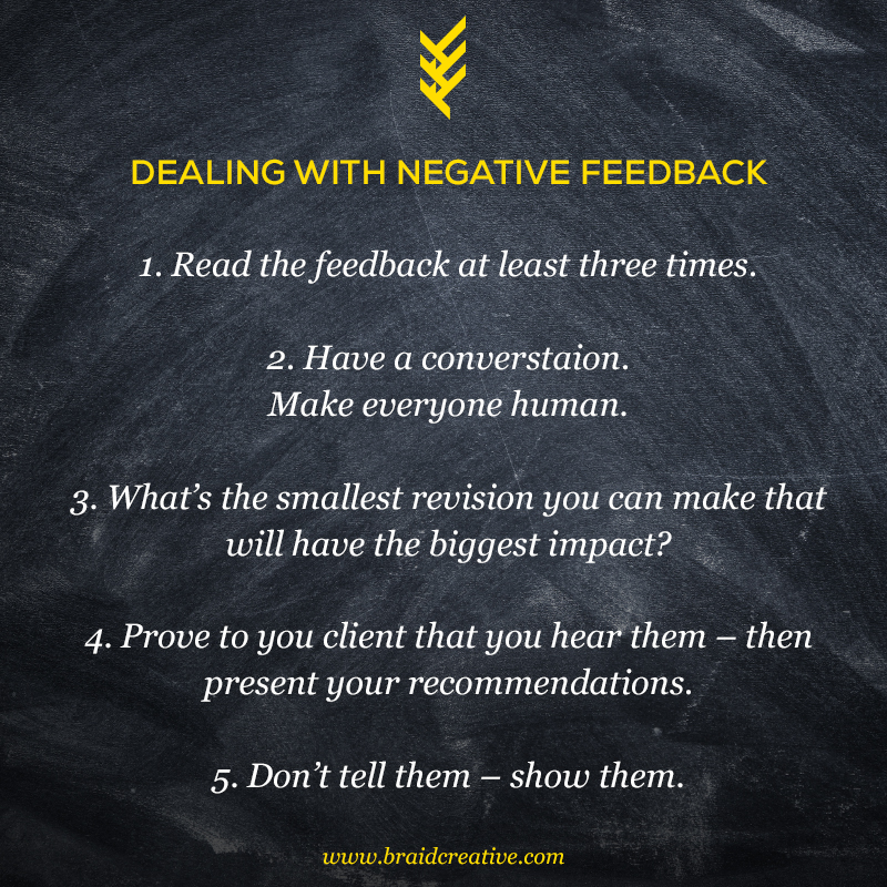
1. Read the feedback at least three times.
It’s really easy to rush to judgments at first glance. You’ll only pick up the very worst parts of what’s being said and come to quick conclusions when your feelings are hurt. So when you receive feedback from a client, be sure to read it at least three times before you start freaking out. If a client is giving you feedback in person, write down, word-for-word, what they’re saying (it’s easy to forget what was said when emotions take over).
Actively listen to your client. What is it they’re actually saying? What are their biggest concerns? Which part of the work, specifically, is and is not resonating with them? Why?
2. Have a conversation. Make everyone human.
Remember, you and your client are both on the same side with the same goals. Get on the phone or face-to-face – reiterate the original objectives of the project, your client’s original input, and explain your creative rationale (without getting defensive). Your client is probably as flustered as you are – they may be feeling a range of emotions as well! What you want in this situation is to remain calm, transparent, and open. Sometimes, going through rough patches with a client (and acting like a kind pro in the process) will only help them trust you even more through the next round of revisions!
3. What’s the smallest revision you can make that will have the biggest impact?
Sometimes criticism can feel HUGE when in fact, you just need to make a small shift. For example, one time I presented a branding project and the client said it just didn’t feel right. At first glance, I thought my client was asking for something COMPLETELY different than what I had designed. But after a little bit of conversation, I realized my client wasn’t jiving with just a few aspects of what I had created. With a slight color-shift and a minor typography change, the brand was still on-point, not that different from my original concept, and made all the difference to my client.

You can even use this tactic to reassure your client that you guys are on the right track. You can say something like: “Okay, after chatting I think we’re still on the right track, and with just a few adjustments, we can easily have a design that both of us feel really good about.”
4. Prove to your client that you hear them – then present your recommendations.
Pretend like you’re in couples therapy with your client – repeat the requested feedback, verbatim, to them. Then share your concerns, insights, and recommendations and plan of attack so everyone gets what they want.

An actual conversation might look like this: “I’m hearing you say that the typography isn’t ‘clean’ enough and you’re looking for something that feels ‘modern’ and ‘sleek’. My suggestion is that we update the expressive typography to something classic, and maybe tone down the accent colors you originally wanted to something a little more neutral, like a metallic, so that it still has a little edge. Is it cool if I try that approach? Keeping in mind your desire for something clean, modern, and sleek, while I make those tweaks?”
5. Don’t tell them – show them.
Your client doesn’t speak the same language you do. Their feedback may read a little harsh only because they don’t have the words to describe what they like and don’t like about the work (which has to be frustrating for them too!). If your work is visual, one of the best things you can do to get back on track is moodboard out an updated design (textures, typography, color palettes, photography, logos, themes, etc.) and ask them specifically which examples they like and ask what they like about it. As you begin to see what they’re gravitating toward, give them language to describe what they like and don’t like.
You might even say something like: “I’m noticing that all the examples you’re pointing out have organic textures paired with black hand-drawn lettering. And while you like hot pink, it appears that most of the brands you like use accent colors in their photography more than the actual brand identity.”

Remember, at the end of the day if you can maintain control over your own emotions, assume the best, act with intention, humanize your motives and your client’s feedback, and strive for a positive outcome everyone is enthusiastic about … then you are truly doing the best you can.

