


Tend Therapy
Brand Strategy & Identity
Lisa Pisha had built a boutique therapy practice with deep roots in her community and a genuine reputation for warm, transformative work. A structural shift in her practice left Lisa’s name “Grow Therapy” tangled up with two other “Grow” practices in her area, including a national conglomerate. It was time to start fresh and build a brand that actually fit. Lisa came to Braid ready to reclaim her practice and her brand – and on her terms.
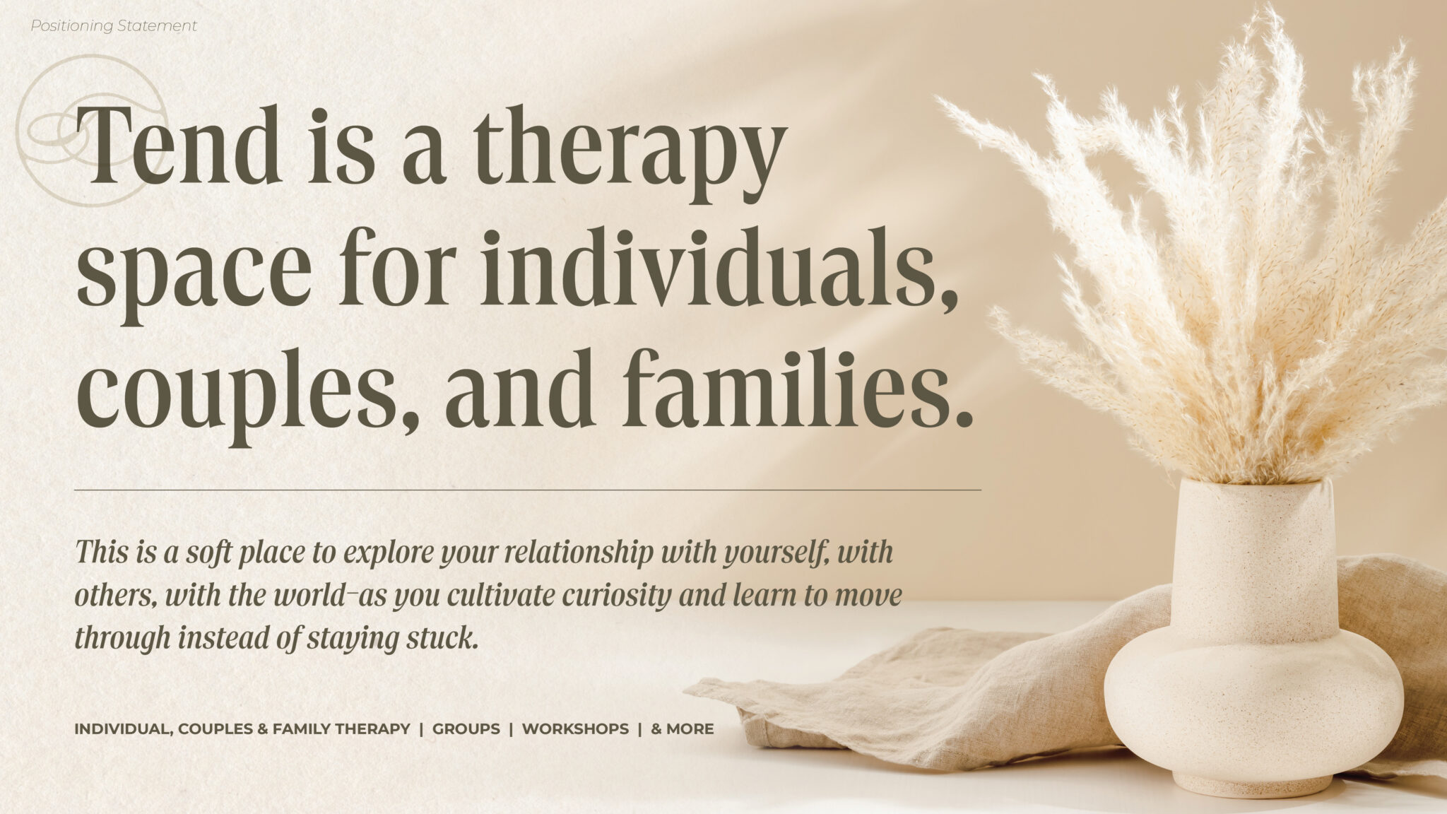
Through the Braid Method®, we helped Lisa and her partner Angie excavate what made their space distinct – a belief that therapy isn’t about finding “normal” but about learning to get curious, hold space for yourself, and move through instead of staying stuck. That philosophy became the foundation for everything.
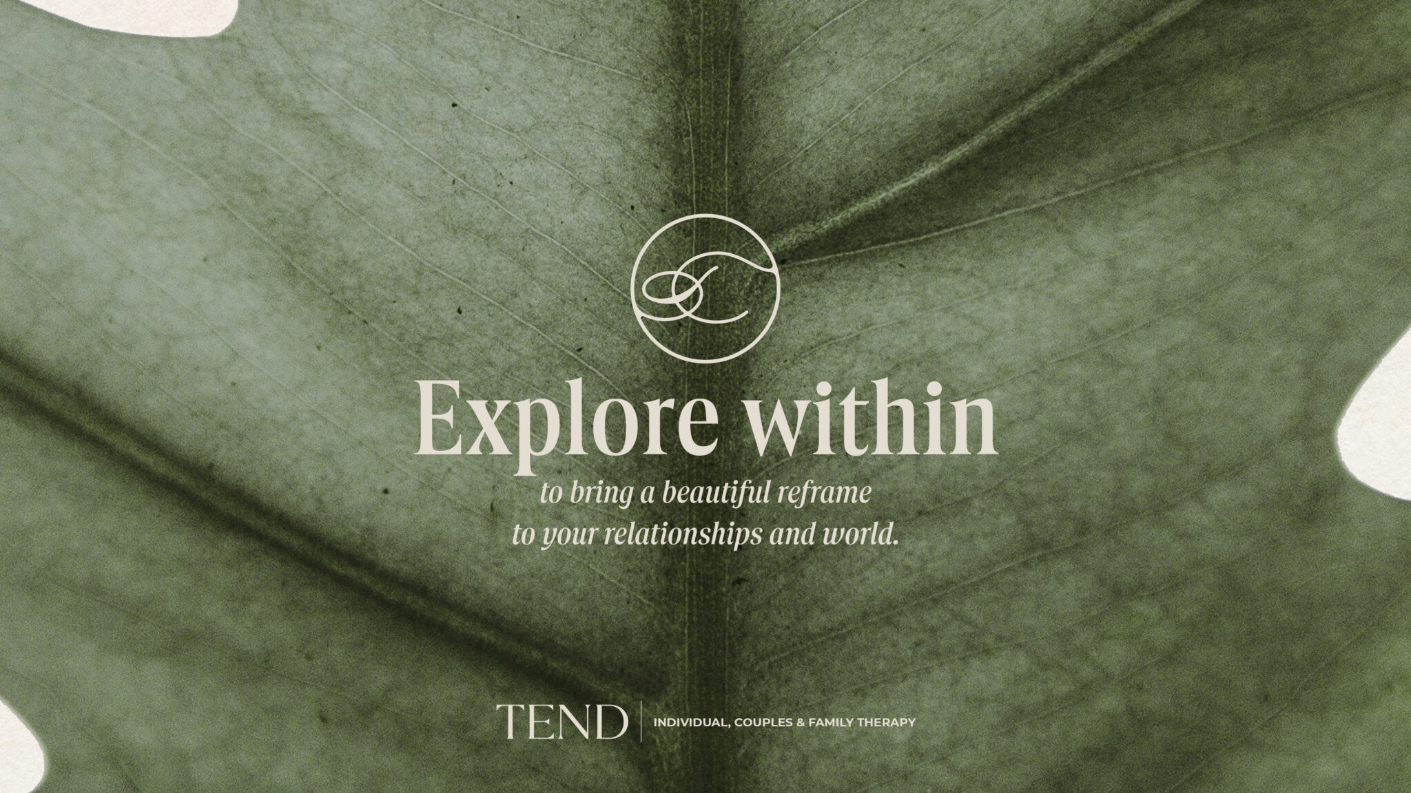
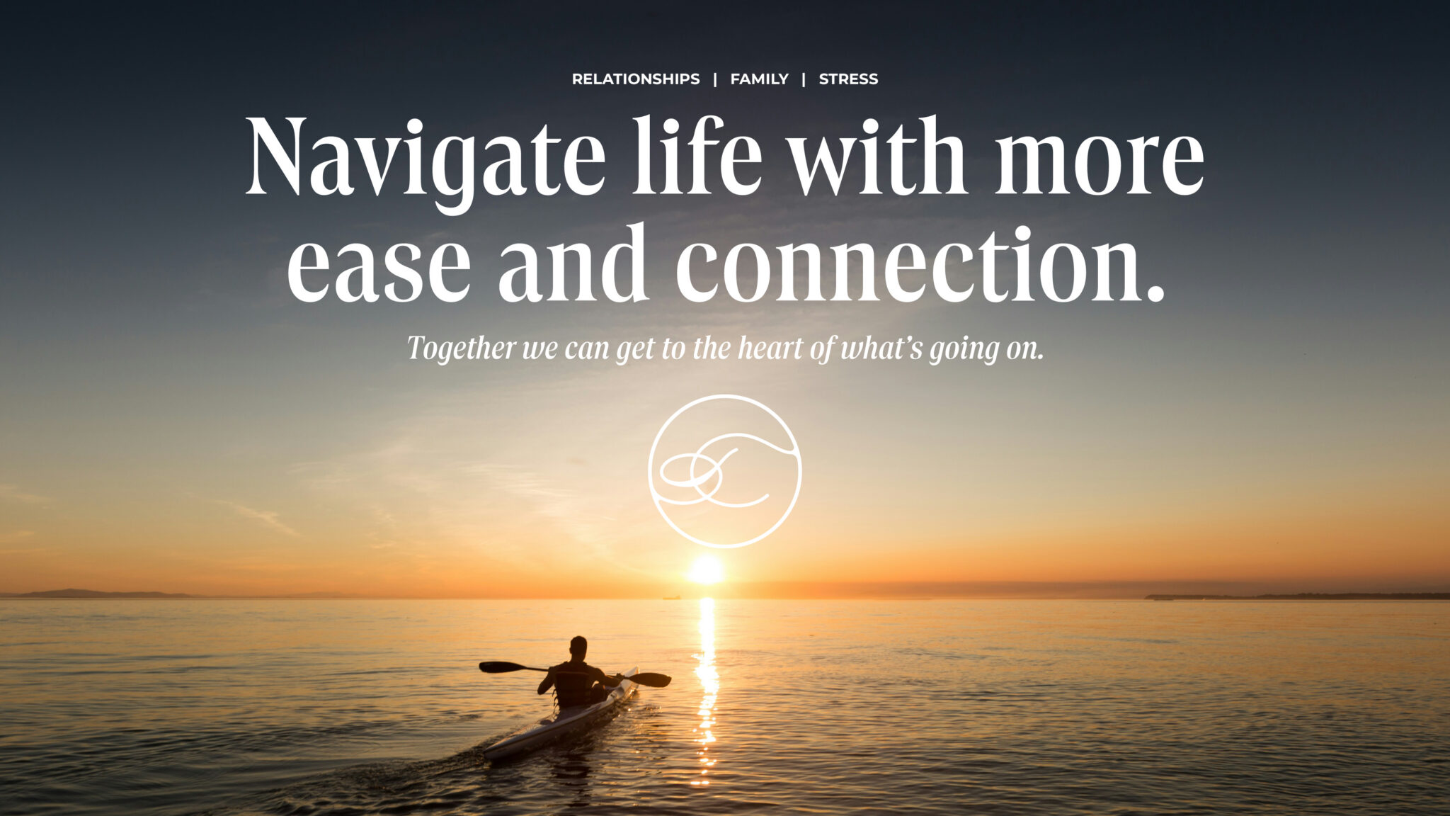
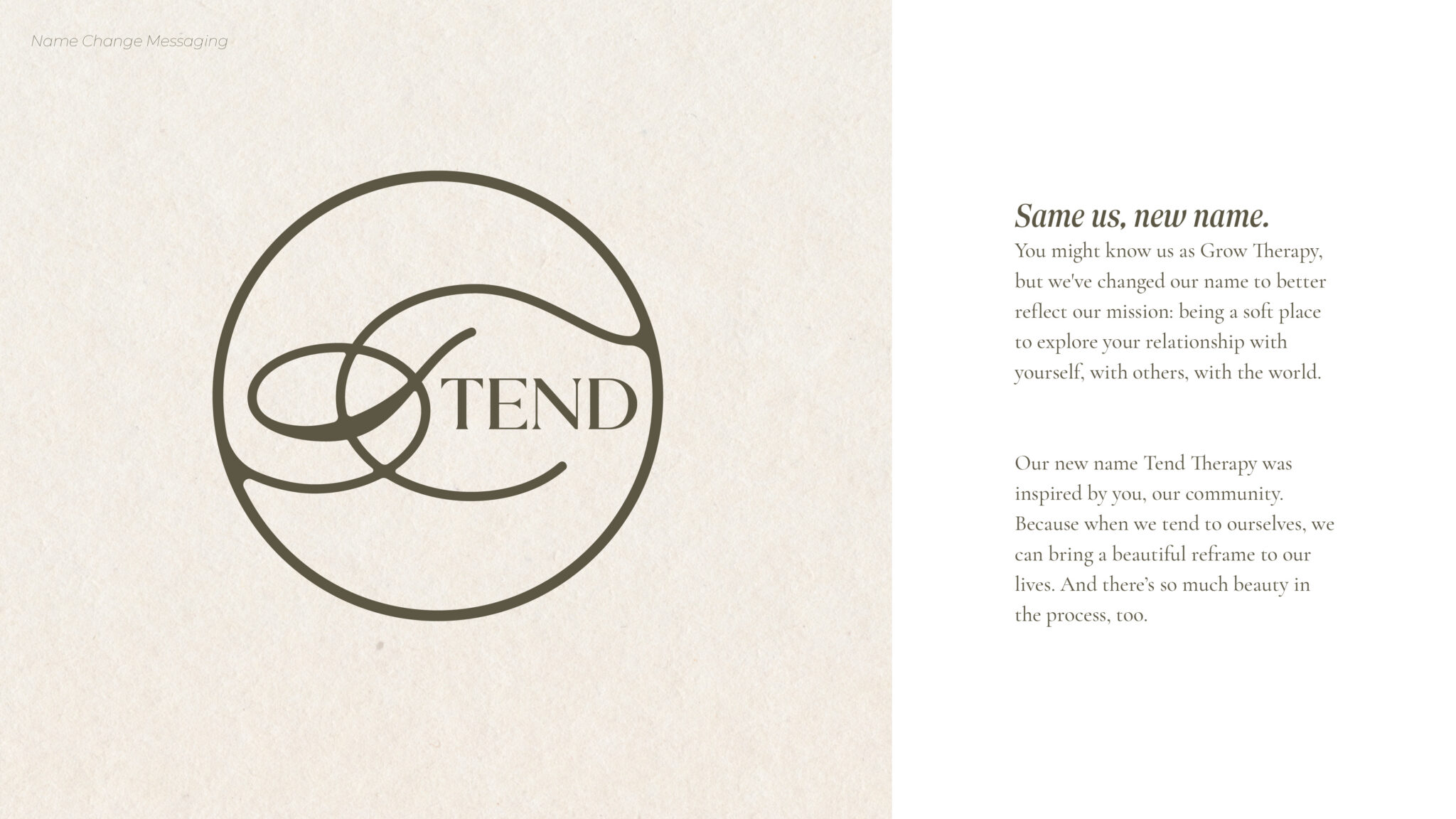
The name Tend rose to the top for exactly the right reasons. It speaks to the act of tending to what’s present – to yourself, your relationships, your growth. It’s a mission and a method, wrapped in a single word.
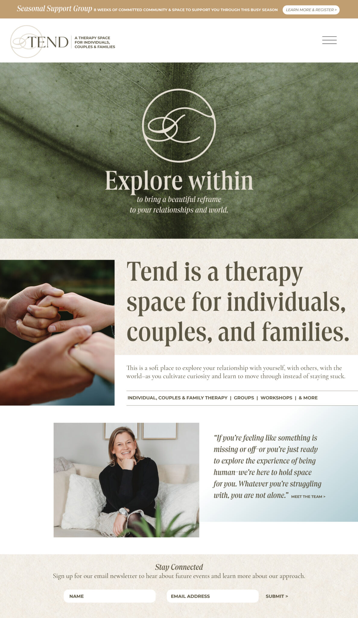
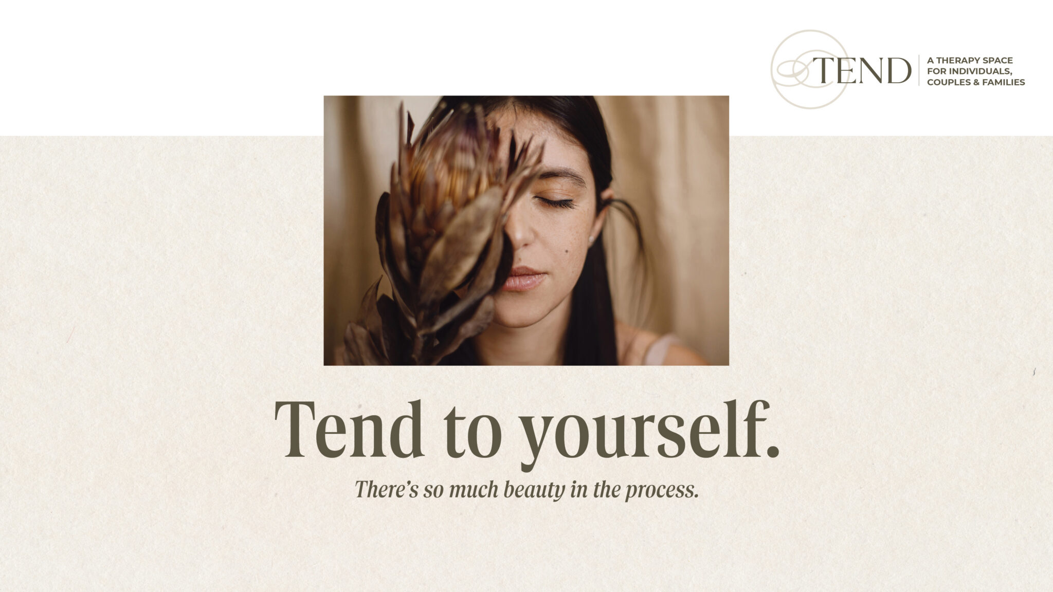
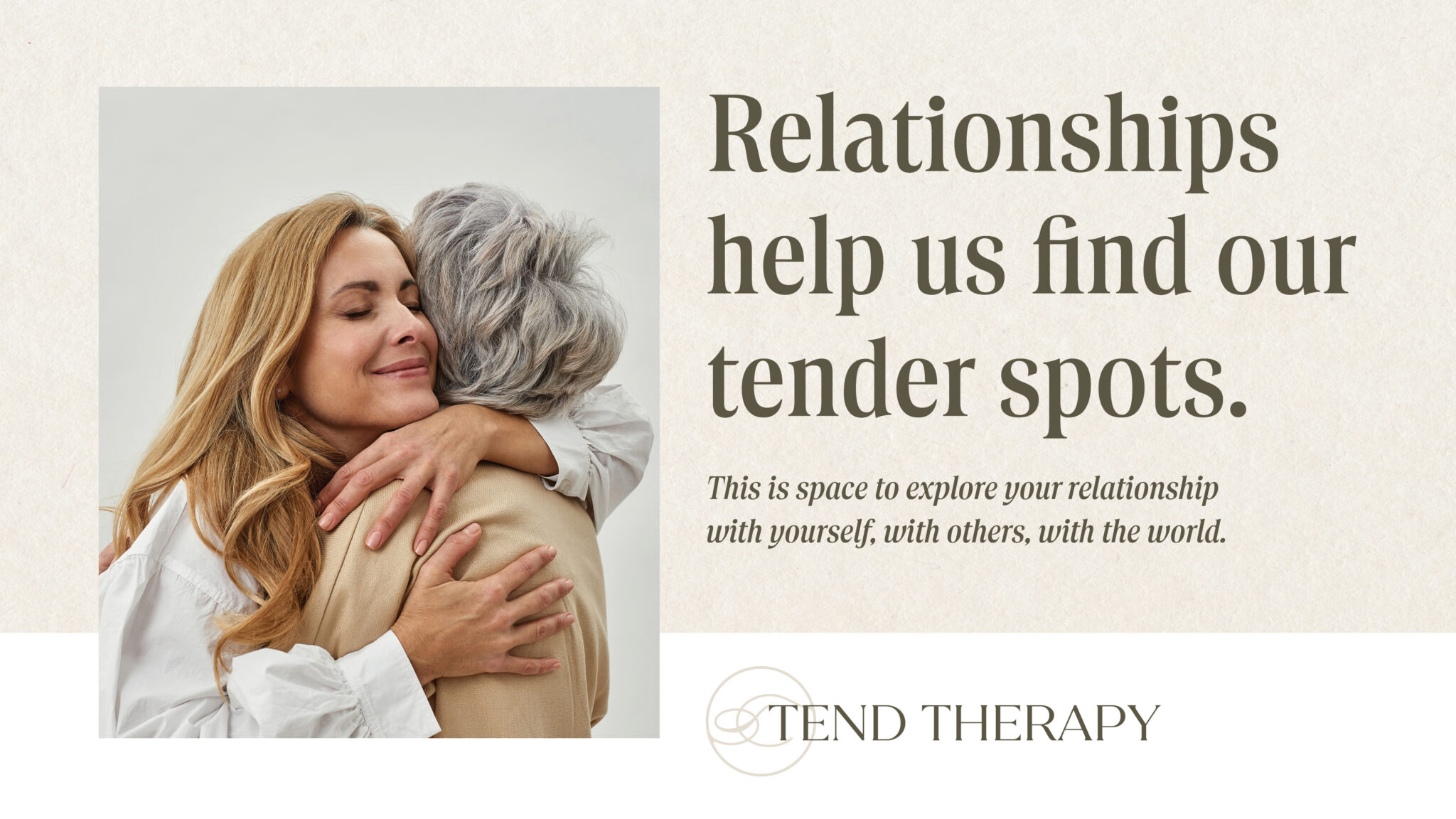
From there, we developed a full brand platform including positioning, messaging, brand story, service descriptions, name-change copy, social templates, website mockup, logo suite, color palette, typography, and photography direction. The visual identity landed in the intersection of earthy and elevated with warm olive greens, soft sand tones, and a fluid monogram mark that evokes connection and continuity.
The result is a brand that’s distinctly theirs.
“We are so incredibly delighted with the logo and look of our new practice name, Tend. All of the fonts and colors, the layouts for everything look amazing. This is truly such a beautiful new home for us all.”
— Lisa Pisha, MS, LMFT | Tend Therapy